Contact
Skip to main content
Mastering the essential rules for the 3 most common charts in data visualization.
Most designers start with good intentions. But when you’re faced with a messy spreadsheet, it’s easy to lose sight of the goal and just start building.
At Hike One, sharing knowledge is part of our culture. At Hike One, sharing knowledge is part of our culture. We host workshops and roundtables in our Amsterdam office to keep our skills sharp. Last October, I joined a two-day chart design course with Nicholas P. Desbarats, the specialist who's taught everyone from NASA to Shopify. I had the chance to join the course and in this article, I'm sharing his golden rules with you.
This is your cheat sheet: the raw, actionable takeaways for the next time you get that giant data file.
Imagine a client sends you a massive Excel file. You might head to Dribbble for inspiration and design something complex and beautiful.
But here is the reality: there are many ways to visualize data, but there's usually only one best way to communicate a specific message. The design magic isn't in the look; it's in the goal. What is your chart's job? To answer a question? To push an audience to act? Or just to highlight key insights?
As Nicholas P. Desbarats says: “If you don’t know why you’re creating a chart, your chart will communicate random insights.”
So forget "what looks cool." Ask: what job does this chart need to do?
There are countless chart types out there. Picking the right chart always comes down to effectiveness, how well it nails the job. Let’s focus on the three workhorses of data visualization.
Invented by the Scottish economist William Playfair in 1786. The bar chart remains the best tool for comparison. Bar charts are accurate, super easy to read, and incredibly flexible Whether they are horizontal, vertical, or stacked, they just work. Use them for:
Use them for:
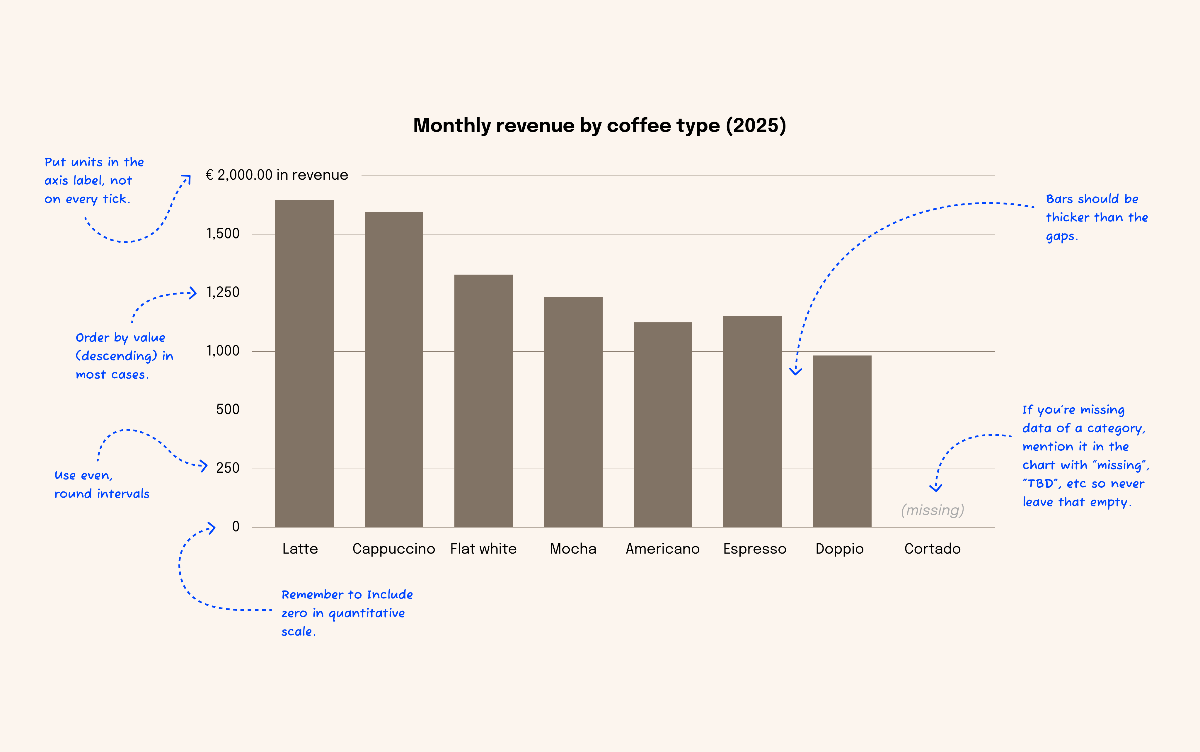
(Image description: When designing a bar chart)
Also introduced by Playfair, these are your best friend for showing change over time. They're intuitive for spotting trends and patterns, making them essential for monitoring metrics.
How to visualize trend and change over time with the Line Chart? While time traditionally flows left-to-right, if you're designing for a local right-to-left (RTL) audience, consider reversing the horizontal axis so time moves from right to left. This aligns the data's flow with the audience's natural reading direction.
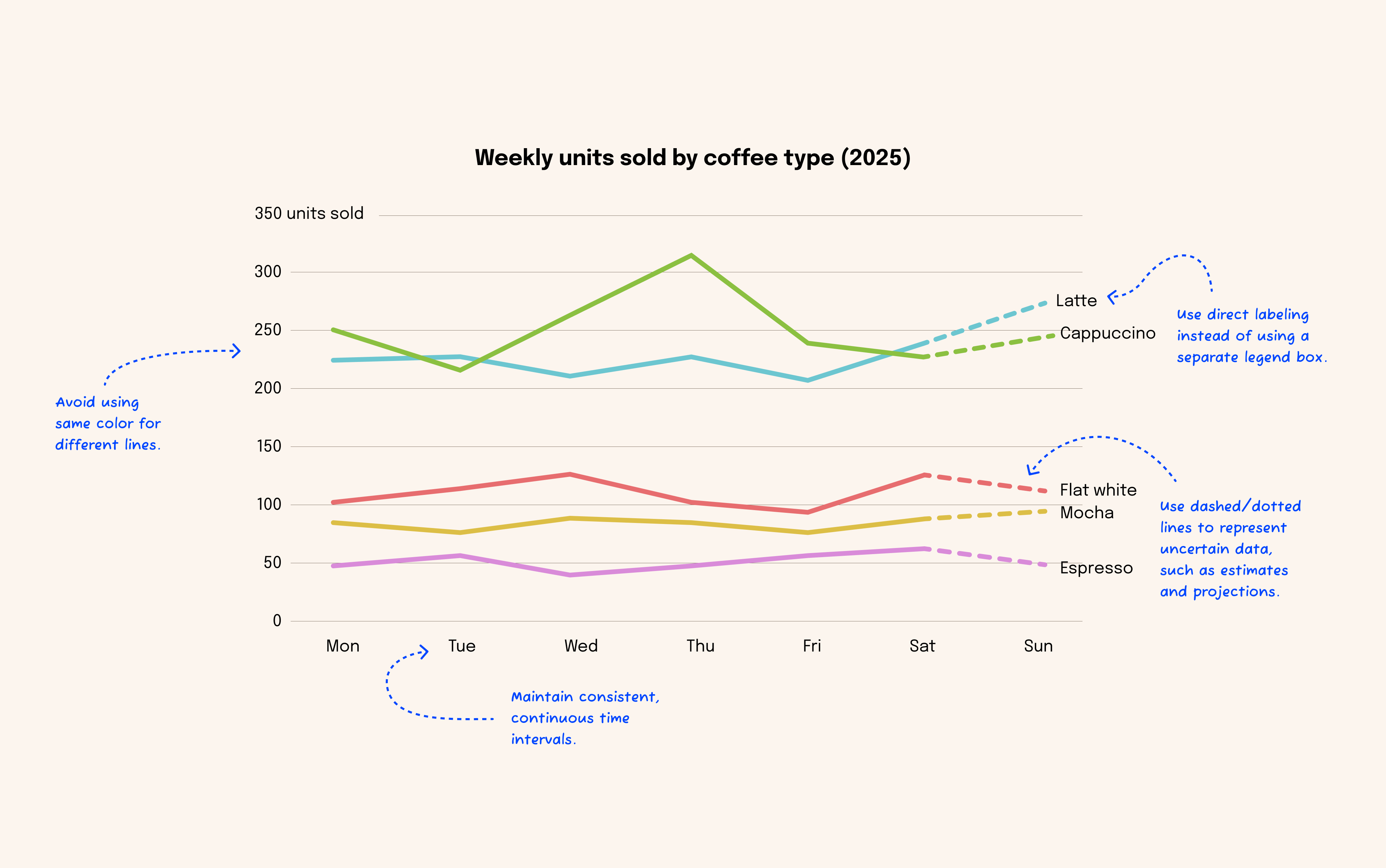
(Image description: Line chart optimization: tips for clear trends)
Playfair is responsible for this one too, though he might regret it. Simple and familiar to non-experts, they are the most criticized charts today, often overused and misused.
Here is why they are frequently misused:
Therefore, if you need to show precise values, skip the pie and use a bar chart.
Use pie charts for:
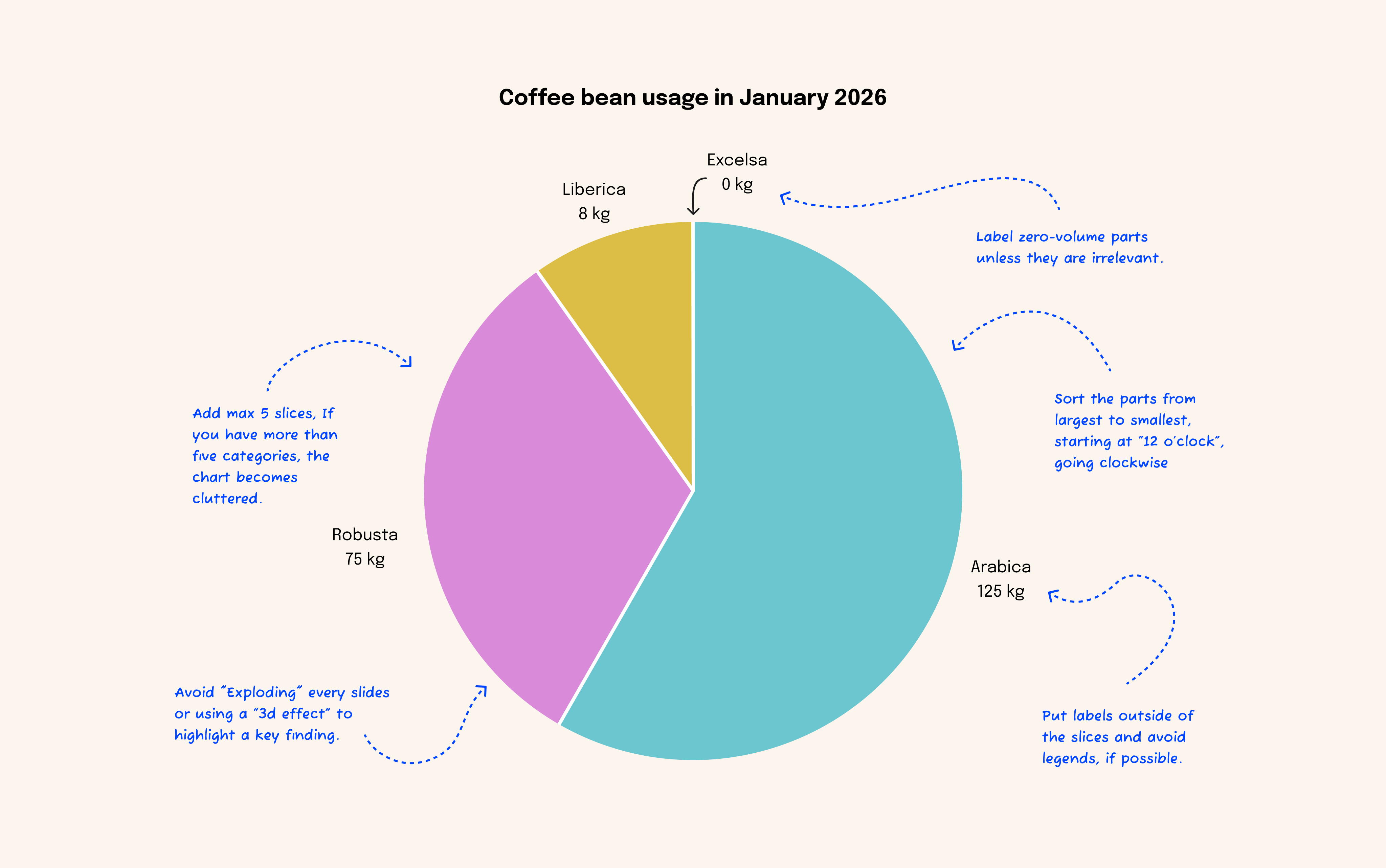
(Image description: Pie chart: tips for a good design)
A smart chart is one that stays out of its own way. Use these suggestions to improve your data storytelling:
Color and palettes
Typography and Context
Stop creating charts that look good. Start creating charts that work. The better your chart does its job, the better your design is.
A sleek chart is useless if it’s not accessible. Our goal is to give everyone, including people using screen readers or those with color blindness, an instant understanding of the data.
Here is the lowdown on making your charts inclusive:
Color should never be the only way to tell data apart. If you flip your chart to black and white and it becomes a guessing game, it’s not accessible.
Those light-grey axis lines might look "minimalist," but they’re invisible to many.
Screen readers can't "see" your pixels. Give them a narrative alternative.
Always include a clean, well-structured data table below your chart. Screen reader users often prefer tables because they can explore the raw numbers at their own pace. If the chart is complex, break it into multiple simple tables rather than one giant, messy one.
Ultimately, data visualization is more than just making things look pretty; it's a critical design skill. The main takeaway? Your intention must drive the design from the start.
By defining the chart's goal, sticking to reliable chart types. Bar and line charts are your essentials for trends and comparisons. And carefully polishing the look (think the right color, clean fonts, and clear context), you turn a raw data file into an undeniable, "I get it" insight. Always prioritize accessibility: high color contrast, clear information for screen readers, and keyboard navigation.
If you're ready to master this, you need to check out Nicholas P. Desbarats. His book, Practical Charts, gives you the complete guide for effective, ethical data communication.
Schedule a call with a designer to see how we can improve your charts. We build clear systems so your team can act on data without getting overwhelmed.


